 Why the Right Typography Sells, and the Wrong One Fails
In the digital age, where milliseconds determine engagement and bounce rates, typography transcends aesthetics, it becomes strategy. For UX designers, product developers, and web strategists, understanding the semiotics of typeface design is no longer optional. It’s fundamental. The right font choice can build trust, guide behavior, and convert; the wrong one can erode credibility and sabotage the user journey.
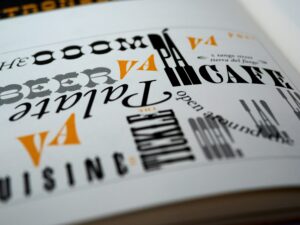
Dissecting Typography:
Typography is visual language. Semiotics, the study of signs and symbols, reveals that every font carries connotations beyond the literal words it composes.
- Serif fonts like Times New Roman or Garamond signal tradition, authority, and editorial weight.
- Sans-serif fonts such as Helvetica or Roboto evoke modernity, clarity, and functionality.
- Display fonts like Lobster or Pacifico can add personality, but can also veer into chaos if misused.
In the context of user experience design, these connotations matter immensely. The subconscious associations users have with fonts shape their perception of your product before they even read a word.
The Psychology of Fonts in Digital Design
Let’s consider the difference between Helvetica Neue and Comic Sans. Both are sans-serif fonts. But while Helvetica Neue is the darling of minimalist design, clean, neutral, and professional, Comic Sans is widely ridiculed. Why? Because Comic Sans signals informality, even immaturity. It’s unsuitable for financial services, healthcare, or any sector where trust is paramount.
In contrast, Open Sans and Lato, popular web-safe fonts, are lauded for their versatility and legibility across digital platforms. Google Fonts has made these ubiquitous, and with good reason, they’re designed to scale responsively, perform well in cross-browser rendering, and support multiple languages.
Case Study: Google’s Typography
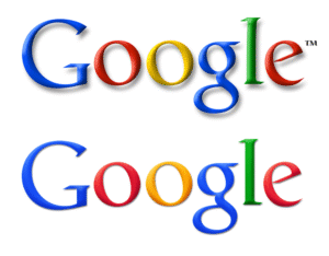
When Google transitioned from its old serif wordmark to a custom sans-serif geometric font: Product Sans, it wasn’t just a design update. It was a semiotic shift. The new typeface conveyed simplicity, speed, and approachability, core values in Google’s UX and brand philosophy. This decision mirrored a wider trend toward flat, human-centered digital design.
Takeaway: Choosing a typeface is not just about aesthetics. It is brand positioning in typographic form.
Conversion-Focused Typography: The Hidden UX Weapon
Typography affects readability, scannability, and hierarchy, all of which drive user retention and conversion rate optimization (CRO). According to a study by MIT’s AgeLab, poor font choices reduce reading speed and increase cognitive load, particularly on mobile. This leads to fatigue, frustration, and ultimately, user drop-off.
Example: Airbnb’s Custom Typeface
In 2018, Airbnb introduced Cereal, a bespoke typeface engineered for consistency across web, mobile, and print. The goal? A unified, accessible typographic voice that balanced friendliness with professionalism. Cereal contributed to a 15% improvement in content legibility and a measurable uptick in sign-ups, according to Airbnb’s internal UX metrics.
Takeaway: A custom or curated font stack tailored to your audience can dramatically improve engagement and conversions.
Accessibility and Typography in UX
Web accessibility (WCAG 2.2) mandates certain legibility standards, particularly around contrast, size, and spacing. Poor typographic choices can make your site non-compliant, risking both legal exposure and user exclusion.
Scopun’s Checklist:
- Use fonts with distinguishable characters (e.g., avoid “l” and “I” confusion).
- Maintain a minimum font size of 16px for body text.
- Use sufficient contrast (at least 4.5:1 for normal text).
- Avoid all-caps blocks which hinder readability.
Best Practices:
- Establish a Typographic Hierarchy: Use font weights and sizes to guide attention (e.g., H1: 36px, H2: 28px, body: 16px).
- Use System and Web-Safe Fonts: Prioritize performance with fonts like Inter, System UI, or Source Sans Pro.
- Limit Font Families: Stick to 2–3 max to ensure design cohesion and page speed.
- Mind the Line Length: Ideal is 50–75 characters per line to enhance legibility.
- Optimize for Mobile First: Responsive typography should scale elegantly across devices.
In the realm of web design, user experience, and digital branding, typography is not decoration, it’s functionality, emotion, and persuasion rolled into one. The semiotic power of typefaces silently guides users: where to look, what to feel, and when to act.
From SaaS dashboards to e-commerce landing pages, the choice between Futura and Georgia, or between Monserrat and Arial, could be the difference between conversion and churn. Typography sells. Misused, it fails. In a digital ecosystem built on attention and trust, designers must wield it with strategic intent.
At Scopun, we don’t just design, we engineer digital experiences where every pixel has a purpose. We understand that typography isn’t decoration; it’s a conversion tool, a branding asset, and a silent persuader. Merging font psychology, accessibility, and performance, from custom typeface integration to scalable font stacks optimized for mobile, we craft typographic systems that don’t just look great, they work great.
Check out this resource to get an idea about Scopun’s expertise:
Download your Free Typography Cheat Sheet
Ready to make your brand’s voice not just heard, but felt?
Contact Scopun, where design meets strategy.


