
Brand Strategy
Before any design, we define your positioning, audience and personality, so the identity we create is distinctive on purpose and aligned with your business goals.
Your brand identity is the sum of every impression your organisation makes, long before anyone reads a word of your copy or clicks a single button. It is the colour someone half-remembers, the shape of your logo on a phone screen, the tone of the email that lands in their inbox and the feeling they get when your name comes up in a meeting. At Scopun, our team treats brand identity as a strategic asset rather than a decorative afterthought, because in a crowded market the businesses that are remembered are rarely the ones that shouted loudest. They are the ones that were clear, consistent and unmistakably themselves.
A logo on its own does very little. What actually moves the needle is a coherent system of strategy, visual language and verbal identity that works together across every place your audience meets you, from a LinkedIn post to a pitch deck to your product interface. That is the difference between a mark you commissioned and a brand you own. Our approach is strategy-led: we start with who you are, who you serve and what you want to be known for, then design the identity that expresses it. Nothing is decorative for its own sake, and every deliverable has a job to do.
Whether you are a founder preparing to raise, a marketing lead consolidating a fragmented look, or an established company that has quietly outgrown its original branding, this page explains how brand identity design actually works, what you receive, how it is measured and what it typically costs in the UK. We keep our process transparent and our deliverables tangible, and we offer a free, no-obligation consultation so you can pressure-test your thinking with people who build brands for a living before you commit a penny.
Strategy-led
identity with a reason behind it
End-to-end
logo to full guidelines
4.6★
Rated on Trustpilot
UK
GMT/BST team
Brand identity design is the system of visual and verbal elements that represent your business — your logo, colour palette, typography, imagery, tone of voice and the rules that hold them together in a set of brand guidelines.
A strong identity makes you instantly recognisable and consistent across every touchpoint. We design that full system — not just a logo — so your brand looks intentional and professional whether someone meets it on your site, on social, or in print.
Our brand identity services include:
Before any design, we define your positioning, audience and personality, so the identity we create is distinctive on purpose and aligned with your business goals.
We design and refine a versatile logo and marks that work at every size and in every context — from a favicon to a billboard — and stand the test of time.
We build flexible colour palettes and type systems with clear hierarchy, accessibility and consistency across digital and print applications.
Icons, patterns, imagery direction and graphic elements give your brand a recognisable look that goes far beyond the logo.
We define how your brand sounds — its language, tone and key messages — so your writing is as consistent and distinctive as your visuals.
We document everything in clear, practical brand guidelines, so your team and any partner can apply the brand correctly and consistently.
We design identities with a reason behind every choice, so your brand is distinctive on purpose and built to support your business goals.
We deliver complete systems and guidelines, so your brand looks intentional and professional across web, social, print and packaging.
Semantic markup, fast load times, mobile-first design, schema and Search Console setup are built into every branding project, not bolted on later.
Every project starts with a written proposal listing scope, deliverables, timeline and cost before any work begins. No hidden fees, no surprises.
We are a UK studio working GMT/BST hours. You work with the same people from start to finish, not a rotating cast of account managers.
Our maintenance plans cover updates, security, performance and content changes, so your project keeps performing long after launch.
Free Consultation
Book a free 30-minute call. We'll map out next steps and send a quote within one business day.
We design in industry-standard tools and deliver organised, ready-to-use files plus clear guidelines, so your brand is easy to apply from day one.
Design
Deliverables
Documentation
Templates
Brand identity pricing in the UK depends on the depth of strategy and the breadth of the identity system you need. The table below gives a realistic guide based on current UK market rates, including where Scopun packages sit.
| Package | UK Market Range | Scopun Starting Price |
|---|---|---|
| Logo & essentials | £800 – £2,500 | From £600 |
| Brand identity system | £2,500 – £6,000 | From £1,800 |
| Full brand + guidelines | £5,000 – £15,000+ | From £3,500 |
| Rebrand / brand strategy | £8,000 – £30,000+ | Quoted individually |
A note on freelancers vs agencies: UK freelance developer rates typically run £30–£80/hr; experienced agencies charge £80–£150/hr. With Scopun, you receive a full team of designers, developers, a project manager, and QA rather than a single point of failure with no cover for holidays, illness, or overload.
Timelines depend on project size, the changes you request, and how quickly you share content. Here are realistic timings from project start:
1 to 2 weeks
Logo & essentials
2 to 4 weeks
Brand identity system
4 to 6 weeks
Full brand + guidelines
6 to 10 weeks
Rebrand / strategy project
Your proposal lists the full timeline before we begin. We track each project with clear steps, weekly check-ins, and a shared plan, so you always see the latest progress.
Every Scopun project follows a clear, proven process. It removes surprises and ensures on-time delivery.
We learn your business, audience, and goals on a free call, then define what success looks like before any work starts.
A written plan with scope, deliverables, timeline and cost. Once you approve it, we build the roadmap and milestones.
We design and prototype before coding. You review and approve the look and flow, with full creative control.
We build from approved designs with clean, semantic, SEO-ready code, testing across devices and browsers throughout.
Performance, responsiveness, forms, payments, browsers and accessibility are all checked. We launch only when everything passes.
We configure DNS, servers, SSL and redirects, then monitor go-live. Expect zero downtime and zero stress.
After launch we handle maintenance, updates, new features and fixes as your long-term technical partner.
We work with UK businesses across many sectors. Each project fits the goals, user needs, and rules of that industry.
Ask ten people to define a brand and most will point at a logo. That is understandable, because the logo is the most visible fragment, but it is only a fragment. Brand identity is the complete, coordinated set of signals your organisation sends into the world: the logo and its variations, the colour palette, the typefaces, the photography and illustration style, the icons, the layout patterns, the way you write and the personality behind it all. Identity is the tangible expression of something less tangible, your brand itself, which lives in the minds of the people who encounter you. You design the identity; the audience builds the brand from it.
It helps to separate three ideas that are often blurred. Brand strategy is the thinking, the decisions about who you serve, how you are positioned and what you stand for. Brand identity is the designed system that makes that strategy visible and audible. Brand is the resulting reputation, the gut feeling people carry about you. When these three fall out of alignment, you get the familiar symptoms: a smart company that looks amateur, a premium service that reads as cheap, or a business that has changed direction but still wears the costume of its former self.
The reason this matters commercially is simple. People make fast, largely subconscious judgements, and a coherent identity lets you shape those judgements deliberately rather than leaving them to chance. A considered identity signals competence and care before a prospect has evaluated a single feature. An inconsistent one quietly undermines trust, forcing your sales and marketing to work harder to overcome a bad first impression that you never intended to create.
Designing an identity without a strategy is like decorating a house before you have decided who is going to live in it. It might look pleasant, but it will not fit the people who have to use it. That is why every serious brand identity project should begin with strategy, not sketches. At Scopun we run a structured discovery phase that interrogates the fundamentals: who your ideal customers really are, what problem you solve better than the alternatives, how you want to be positioned relative to competitors, and what values you are prepared to be judged by. These answers become the brief that every subsequent design decision is measured against.
Positioning is the sharpest tool in this phase. It forces a choice about the space you want to occupy in your audience's mind and, crucially, what you are willing not to be. A brand that tries to appeal to everyone tends to resonate with no one. We help you find the defensible, ownable position that plays to your genuine strengths, then we translate it into a clear value proposition and a messaging framework that your whole organisation can rally behind. This is the part clients most often thank us for later, because it makes a hundred smaller decisions easier for years afterwards.
Audience understanding runs alongside positioning. The way you present a legal-tech platform to compliance-conscious enterprise buyers is worlds apart from the way you present a direct-to-consumer wellness brand to time-poor millennials. Understanding your audience's expectations, anxieties and reference points lets us design an identity that feels native to them rather than imposed on them. When strategy leads, the design phase becomes faster and less subjective, because we are no longer debating taste; we are evaluating fit against an agreed brief.
A modern logo is rarely a single lockup. It is a small system designed to perform in radically different contexts, from a billboard to a browser tab. A well-built logo system typically includes a primary logo for standard use, one or more secondary or horizontal variations for tight spaces, a standalone symbol or monogram for when the full name is not needed, and a favicon or app-icon treatment that stays legible at tiny sizes. Each version is drawn deliberately so that your identity holds up whether it is embossed on a business card or squeezed into a sixteen-pixel tab.
Good logo design is engineering as much as art. We consider how the mark behaves in a single colour, reversed out of a dark background, at speed on a moving screen and beside competitors in a crowded feed. We test legibility at scale, check that it works in monochrome for situations like invoices and etching, and ensure there is a clear symbol that can stand alone as your recognition grows. The aim is a mark that is distinctive enough to be memorable and simple enough to be reproduced anywhere without losing its character.
We are also candid about what a logo can and cannot do. A logo does not, on its own, communicate what you do or why you are better; it becomes a container for meaning over time as people accumulate experiences of you. That is why we design logos to be flexible and durable rather than chasing whatever style happens to be fashionable this year. A logo you have to redraw every two years is a false economy; one built on sound principles can serve you for a decade or more.
Colour is the fastest-acting element of any identity. People register it before shape and long before words, and the right palette can make a brand feel confident, warm, clinical or premium in an instant. A proper colour system is more than a favourite hue and a couple of accents. It defines primary brand colours, supporting secondaries, neutrals for backgrounds and text, and functional colours for states like success, warning and error in digital products. Each colour is specified precisely across the formats you will actually use, including HEX and RGB for screens, CMYK for print and, where relevant, Pantone references for brand-critical applications.
Accessibility is not an optional extra; it is part of doing the job properly. We build palettes that meet the contrast ratios set out in the Web Content Accessibility Guidelines so that text remains readable for people with low vision and in difficult conditions like bright sunlight. This protects a meaningful share of your audience, reduces legal and reputational risk, and generally produces cleaner, more confident design. A colour that looks lovely on a designer's calibrated monitor but fails contrast on a commuter's phone in daylight is not a colour that is doing its job.
We also plan for the realities of digital and dark interfaces. That means defining how colours behave on light and dark backgrounds, how they translate into user-interface tokens, and how they degrade gracefully when only one or two colours are available. The result is a palette that is expressive enough to feel like you and disciplined enough to remain consistent across print, web and product without constant reinterpretation.
Typography does an enormous amount of quiet work. It carries the majority of your written communication, so its personality colours everything from your homepage headline to the small print on an invoice. A typography system usually pairs a display or heading typeface with a highly legible body typeface, and defines a clear hierarchy of sizes, weights and spacing so that information is easy to scan and pleasant to read. The pairing should express your brand's character, a geometric sans for modern precision, a humanist face for approachability, a considered serif for authority, while remaining practical across long-form and interface text.
Pairing typefaces well is a craft. The two faces need enough contrast to create visual hierarchy but enough harmony to feel like they belong together. We consider language support, available weights, licensing terms and, importantly, web performance, because a beautiful typeface that loads slowly harms both experience and search performance. Where budget or licensing is a concern, we can specify high-quality open-source or system typefaces that keep costs down without looking generic, and we always document sensible fallbacks.
Consistency is what turns typography from decoration into recognition. By defining a type scale and clear usage rules, we make sure a heading looks like your heading whether it appears in a blog post, a proposal or a mobile app. Over time this repetition becomes part of how people recognise you, a subtle but powerful contributor to a brand that feels considered and coherent rather than assembled from whatever font was nearest to hand.
How a brand sounds matters as much as how it looks, yet verbal identity is the part most often left to chance. Tone of voice is the consistent personality that runs through your writing, whether you are welcoming a new customer, explaining a price rise or apologising for an outage. A defined verbal identity covers the character of your voice, the vocabulary you favour and avoid, how you handle grammar and formatting choices, and how the tone flexes across situations without ever stopping sounding like you. It is the difference between copy that could belong to anyone and copy that is unmistakably yours.
We build verbal identity from the same strategic foundation as the visuals, so the two reinforce each other. A brand that looks warm and human but writes in stiff corporate jargon sends a confusing signal, and confusion erodes trust. We define voice principles, provide practical do-and-don't examples and often supply ready-to-use messaging building blocks, boilerplate descriptions, value-proposition statements and headline patterns, so that everyone who writes on your behalf produces work that feels of a piece.
The payoff is scale. Most organisations have many people writing in the brand's name, from founders and marketers to support agents and freelancers. A documented tone of voice lets all of them sound coherent without funnelling every sentence through one person. It speeds up content production, reduces rework and, most importantly, ensures your audience meets a single, consistent personality wherever they encounter your words.
Beyond the logo, colour and type sits a wider visual language that gives your brand texture and depth. This includes your approach to photography and illustration, a coherent icon set, and the graphic devices, patterns, shapes, layout grids and motifs, that make your materials instantly recognisable even when the logo is not in view. Some of the most distinctive brands are identifiable from a single cropped image or a background pattern, precisely because they invested in a graphic language rather than relying on the mark alone.
We define a clear direction for imagery so that everything you publish feels intentional. That might mean art-direction principles for photography, composition, lighting, subject and treatment, or a bespoke illustration style, or curated guidance for choosing stock that does not look like stock. Iconography is designed as a family with a consistent stroke weight, corner treatment and level of detail, so that icons read as a set rather than a mismatched collection gathered over time.
The purpose of this layer is flexibility with consistency. A well-defined graphic language gives your team room to create fresh materials, campaigns, social posts, presentations, without every new asset needing a designer's intervention or drifting away from the brand. It is what allows a brand to feel alive and varied while still, unmistakably, looking like itself.
Brand guidelines are where an identity becomes usable by other people. Without them, a beautiful set of assets slowly falls apart as different hands interpret it differently. Guidelines are the reference document, and increasingly the shared digital resource, that captures every decision and shows how to apply it. A thorough set covers the strategy in brief, logo usage and misuse, clear space and minimum sizes, the full colour system with values, the typography system and scale, imagery and iconography direction, tone of voice, and worked examples across real applications.
The value of guidelines is protective and practical. They protect the investment you have made by preventing well-meaning drift, the slightly-off colour, the stretched logo, the rogue typeface, that accumulates until a brand looks tired and incoherent. They are also practical, because they let new employees, agencies, printers and freelancers get things right the first time without a briefing call. Good guidelines answer questions before they are asked, which saves everyone time and protects consistency at the exact moments you are not in the room.
We keep our guidelines clear and genuinely usable rather than producing a weighty document that no one opens. The best guidelines show as much as they tell, with examples of correct and incorrect usage side by side, and are structured so someone can find what they need in seconds. Depending on your needs, we can deliver them as a polished document, a shared online reference, or a living resource that grows with your brand.
A brand only creates value once it is out in the world, so the rollout is as important as the design. Guidelines tell people the rules; templates let them follow the rules effortlessly. We produce the practical assets your team uses every day so that staying on-brand is the path of least resistance rather than a chore. That typically includes social-media templates and profile assets, presentation and pitch-deck templates, document and proposal layouts, email signatures, and stationery such as business cards and letterheads where they are still relevant to your sector.
The principle behind good templates is that consistency should be easy and inconsistency should be hard. When a marketer can drop a headline and image into a ready-made, on-brand social template in minutes, they will, and your feed stays coherent. When every post has to be built from scratch, standards slip under deadline pressure. We design templates in the tools your team actually uses, so the identity survives contact with the daily reality of a busy organisation.
We also plan the sequence of a rollout so it lands well. A rebrand or new identity going live across a website, social channels, products and physical collateral benefits from a coordinated launch rather than a scattered, piecemeal reveal. We help you prioritise the highest-visibility touchpoints, prepare the assets in advance and switch over cleanly, so the new brand arrives looking deliberate and complete rather than half-finished.
Rebranding is one of the highest-stakes decisions a business makes, and it is worth being clear about when it is genuinely warranted. Good reasons include a strategic shift such as a new market, product or business model; a merger or acquisition; an identity that has aged badly or no longer reflects the quality of what you deliver; legal or naming conflicts; or a look so inconsistent it is actively holding you back. Weak reasons include simple boredom on the part of leadership, because internal fatigue with a brand almost always arrives long before your audience tires of it.
The central risk in any rebrand is losing brand equity, the accumulated recognition and goodwill attached to your existing identity. The solution is rarely a total teardown. Often the smarter path is evolution rather than revolution: keeping the elements that carry recognition, a distinctive colour, a well-known symbol, a familiar name, while modernising execution and fixing what genuinely does not work. We assess what equity you hold before we change anything, so we protect the parts of your identity that are quietly doing valuable work.
Execution and communication are what separate a successful rebrand from a damaging one. We plan the transition carefully, prepare a full set of new assets, and help you tell the story of the change to customers, staff and partners so it reads as considered progress rather than an unsettling break. A rebrand done well signals momentum and ambition; a rebrand done carelessly can confuse loyal customers and squander years of recognition, which is exactly why the strategy that precedes it matters so much.
For most modern businesses, the brand experience that matters most happens on a screen. Your website, web app or product interface is where prospects form lasting impressions and where customers spend real time, so an identity that stops at the printed page is only half-finished. As a software studio, this is where Scopun is particularly well placed: we design brands that are built to live in digital products from the very beginning, not retrofitted awkwardly after launch.
Digital alignment means translating brand foundations into the practical building blocks of interface design. Colours become design tokens with defined roles and states, typography becomes a responsive type scale, spacing and layout follow a consistent grid, and iconography plugs directly into components. Done properly, this bridges the frequent gap between how a brand looks in its guidelines and how it actually renders in the product, a gap that quietly undermines many otherwise strong identities.
Because we build software as well as brands, we can carry an identity all the way through to a coherent design system that developers can implement faithfully. That continuity, from brand strategy to visual identity to a living, coded interface, is difficult to achieve when branding and product are handled by separate teams that never speak. Keeping them under one roof means the brand your customers meet on your website is the same brand you defined on day one, expressed with the fidelity it deserves.
Branding is sometimes dismissed as unmeasurable, but that is only true if you refuse to define what success looks like at the outset. We are careful not to promise specific numbers, because honest results depend on your market, budget and execution, but there are well-established indicators that a strong identity improves over time. Brand awareness and recall, how readily people recognise and remember you, tend to rise with a distinctive, consistent identity. So does the ease with which your sales and marketing convert attention into interest, because a credible brand does some of the persuading before a conversation even starts.
There are qualitative and quantitative signals worth tracking. Qualitatively, you can watch how customers describe you in their own words, whether the language aligns with your intended positioning, and how confidently your own team represents the brand. Quantitatively, you can monitor direct and branded search traffic, engagement across channels, consistency of presentation in audits, and, over the longer term, the pricing power and preference that a trusted brand tends to earn. The key is to agree the measures that matter to you before the project, then review them over a realistic horizon.
It is important to be realistic about timescales. Brand equity compounds; it is built through repeated, consistent exposure rather than delivered overnight. The clearest early win is usually coherence itself, the moment your touchpoints stop contradicting each other, which pays off immediately in credibility. The deeper commercial benefits, preference, loyalty and the ability to command a premium, accrue steadily as the market's familiarity with you grows.
Brand identity pricing in the UK spans an enormous range, which can be bewildering, so it helps to understand what actually drives the number. At the lower end, a freelancer or an online logo service might deliver a logo and a handful of assets from a few hundred pounds. A more complete identity from a small studio, including strategy, a logo system and basic guidelines, commonly runs from the low thousands into the mid five figures. Full strategic branding programmes for larger or more complex organisations extend well beyond that. The right number depends on scope, seniority, strategic depth and how much of the rollout you need delivered.
The freelancer-versus-studio decision is really a question of scope and risk. A talented freelancer can be excellent value for a focused piece of work, such as a single logo, but a strong identity system involves strategy, multiple disciplines and coordinated rollout, which is where a studio's breadth pays off. With a studio you are buying not just design hours but a process, a range of specialisms and accountability for a coherent result. The cheapest option is rarely the most economical once you account for the cost of redoing work that was not built to last.
We keep our pricing transparent and scope-based, with clear from-price positioning so you know what a given level of investment includes before you commit. We would always rather scope a project honestly to your stage and budget than sell you more than you need or, worse, less than will actually work. That is exactly what our free consultation is for: a straightforward conversation about what your situation calls for and what it should realistically cost, with no obligation to proceed.
Every organisation has a brand whether it manages it or not, but some sectors feel the returns from deliberate branding especially keenly. Technology and SaaS companies benefit because they are often selling something intangible to a sceptical audience, where credibility and clarity are decisive. Professional services such as law, finance, consulting and accountancy rely heavily on trust, and a considered identity signals the competence that clients are effectively paying for. Startups preparing to fundraise gain because investors read brand maturity as a proxy for how seriously the team takes execution.
Consumer-facing sectors, retail, hospitality, wellness, food and drink, compete in visually crowded markets where distinctiveness and emotional resonance directly influence choice at the point of decision. Healthcare and education providers benefit from identities that balance authority with approachability, reassuring people at moments that often carry real anxiety. Even traditionally low-profile sectors like manufacturing, logistics and B2B services find that a sharper brand helps them stand out to buyers who are increasingly making decisions through a digital-first lens.
Our team works across these sectors, and our strategy-led approach adapts to each context rather than imposing a house style. Whatever your industry, the underlying logic holds: a clear, consistent, well-built identity lowers the cost of earning attention and trust, and raises the return on every pound you spend on marketing and sales. If you are weighing up whether the investment is right for your stage, the most useful next step is simply to talk it through, which is precisely what our free consultation offers.
Brand strategy, logo design, colour and typography systems, visual identity and assets, tone of voice, and complete brand guidelines. We also provide ready-to-use templates for social, marketing and stationery.
A logo and essentials package starts from £600, a full identity system from £1,800, and a full brand with guidelines from £3,500. Rebrands and brand strategy projects are quoted individually after a free consultation.
A logo and essentials take 1–2 weeks, a full identity system 2–4 weeks, and a complete brand with guidelines 4–6 weeks. Your timeline is confirmed in writing before work begins.
That is up to you. We offer a logo-only package, but we recommend a full identity system — colour, type, assets and guidelines — so your brand stays consistent everywhere it appears.
Yes. We design adaptable, accessible systems and deliver organised files so your brand looks right on your website, on social, and in print and packaging.
Yes. We carry out rebrands and refreshes that modernise your identity while protecting the recognition and equity you have already built.
Yes. As a full-service studio, we can apply your new identity directly to a website, store or app, so your brand comes to life consistently online.
You receive a full logo suite, colour and type systems, icons and assets, ready-to-use templates, and clear brand guidelines, all organised and ready to apply.
Case studies
Real client websites we have redesigned, shown as they were and as they are now.
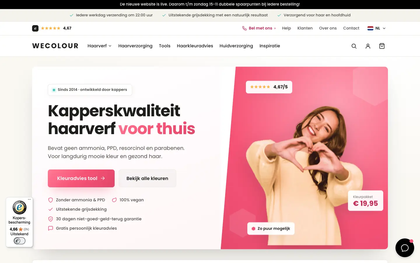
Hair colour eCommerce
WECOLOUR
A full UI/UX redesign for a Dutch hair colour webshop
See before & after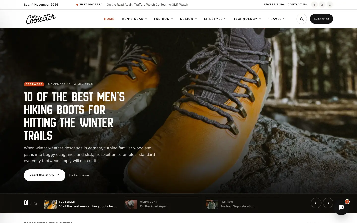
WordPress · Online magazine / publishing
The Coolector
A magazine-style redesign for a men’s lifestyle publication on WordPress
See before & after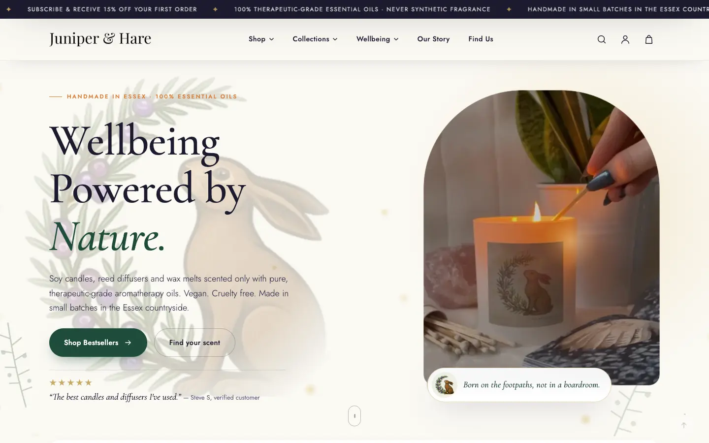
Shopify · Home fragrance & wellbeing eCommerce
Juniper & Hare
From a basic GoDaddy shop to a Shopify store with real character
See before & afterTell us about your project — free consultation, we reply within one business day.
Your brand should make the right impression instantly and stay consistent everywhere people meet it. At Scopun, we design strategy-led, cohesive brand identities for UK businesses that build trust and stand out.
Whether you are starting fresh or rebranding, we are ready to help. Book your free consultation today.